This home was a fun stage! Not only was it full of a sweet family who happens to be wonderful friends, but it was a warm home which has been loved to life by the current owners.
Kitchen Before:
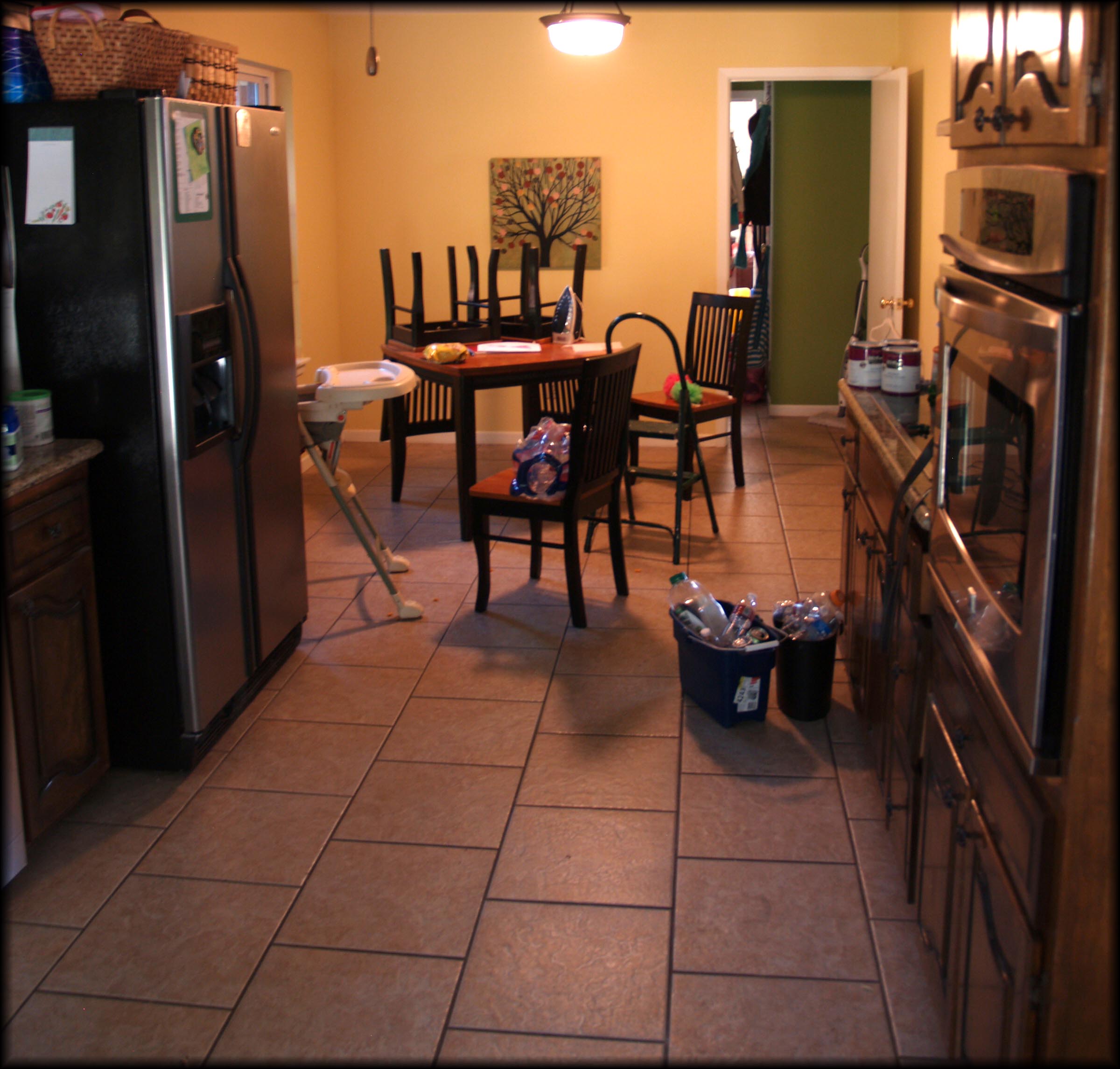
A HUGE kitchen with an eat-in area is a great selling point, especially for an active family like our homeowners. But an odd dining layout and a bit of countertop clutter may make it hard for the buyers to see this great feature.
KITCHEN AFTER:
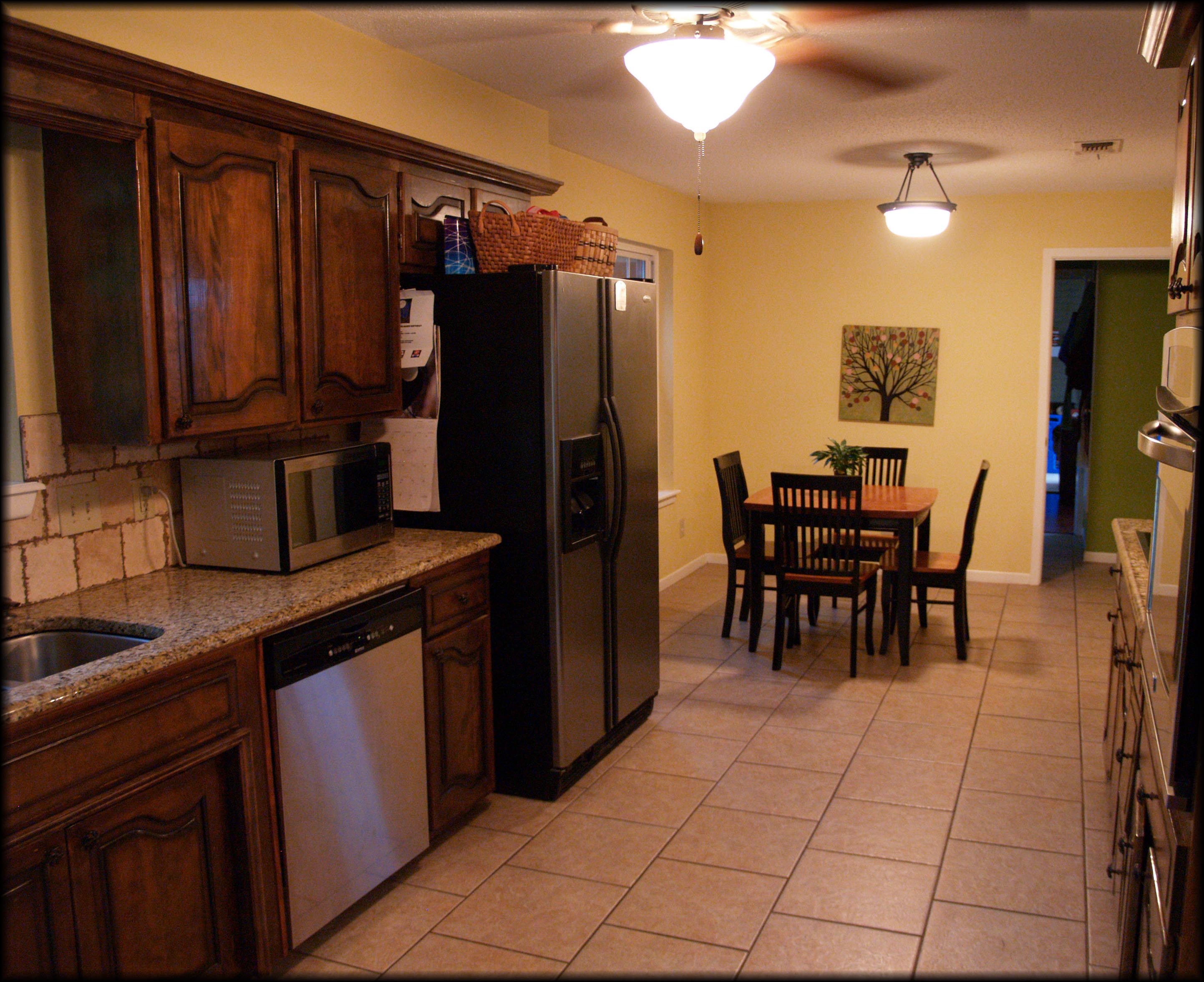
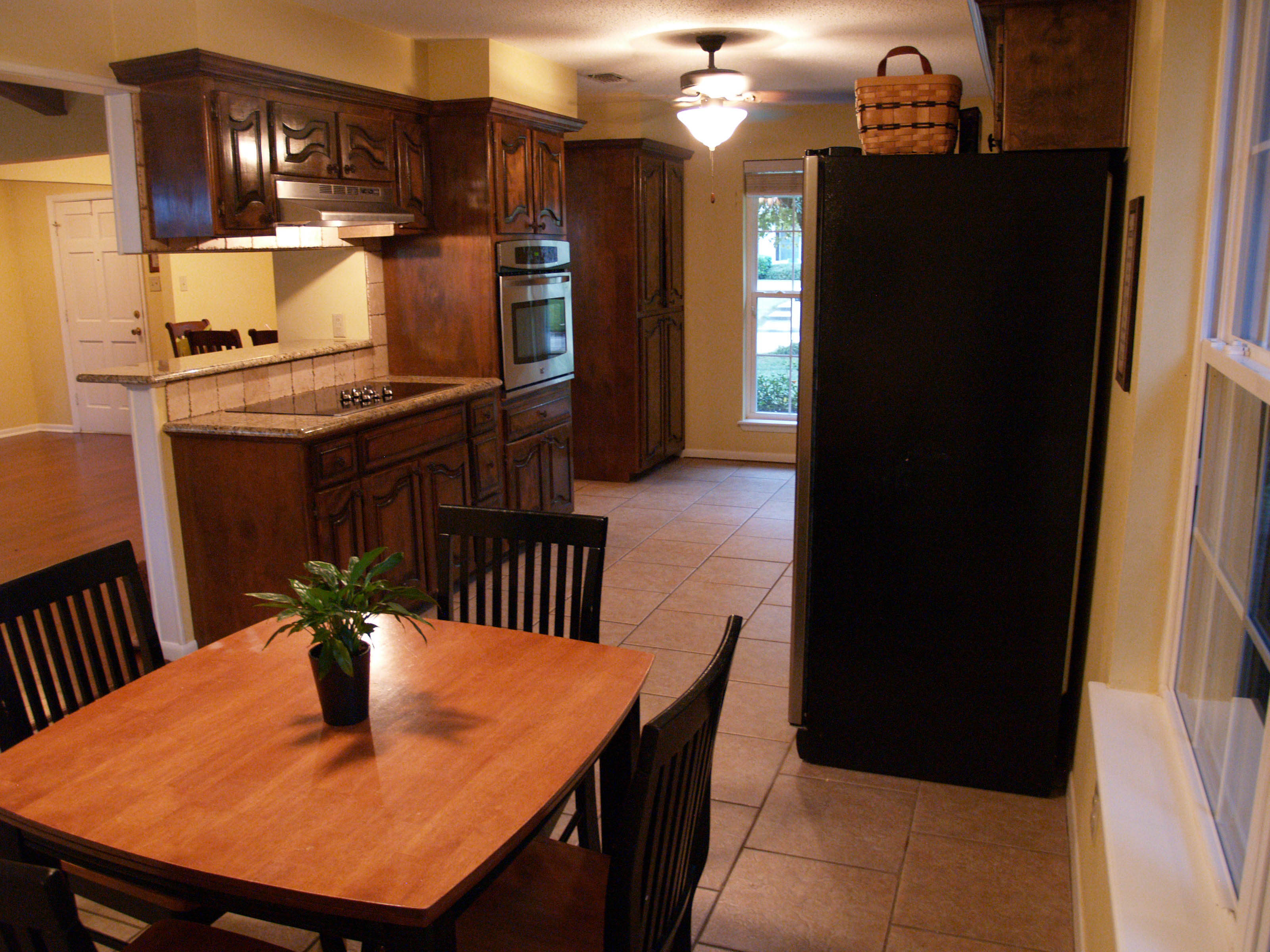
Always, first thing in any room….de-clutter. Countertops are a common catch-all for anything from our ten different small appliances to the three knife block sets that you got as wedding gifts. The less on the countertops the better! These were beautiful granite countertops that deserved to be showcased. I know refrigerators serve as an amazing gallery for your children’s artwork, but before putting your house on the market take those sweet mementos down and box them up. No worries, if staged properly your house won’t be on the market long and the artwork can come back out! Also, notice the table was turned at an angle before, which causes the flow of the room to not feel as natural. Losing the clutter and changing the angle makes the space feel more open.
Master Bedroom Before:
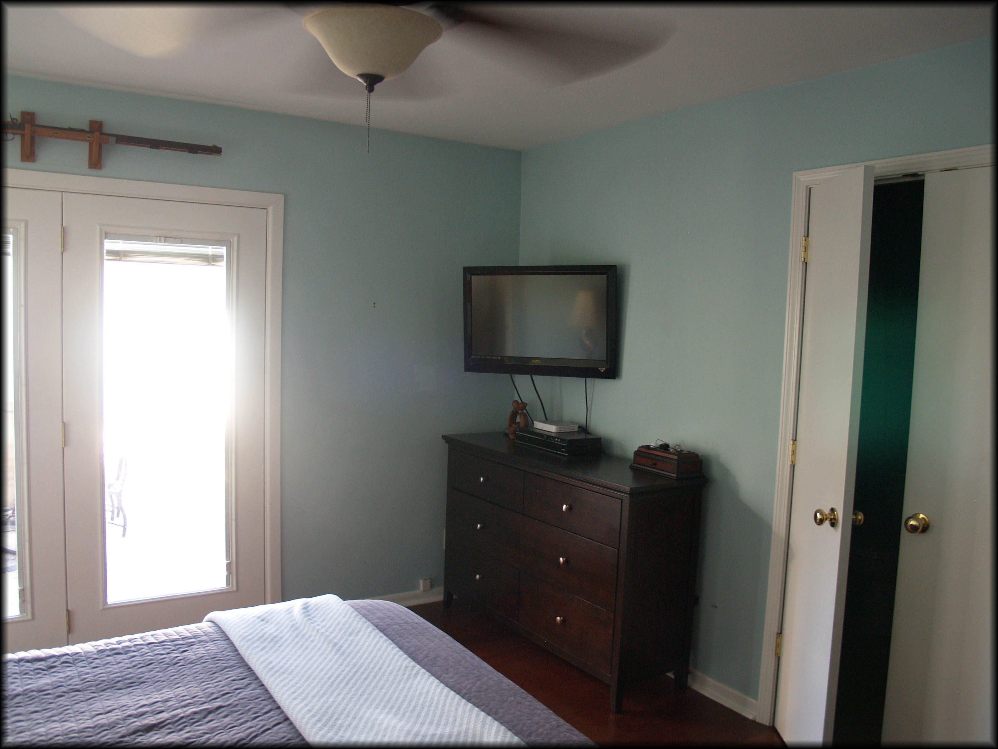
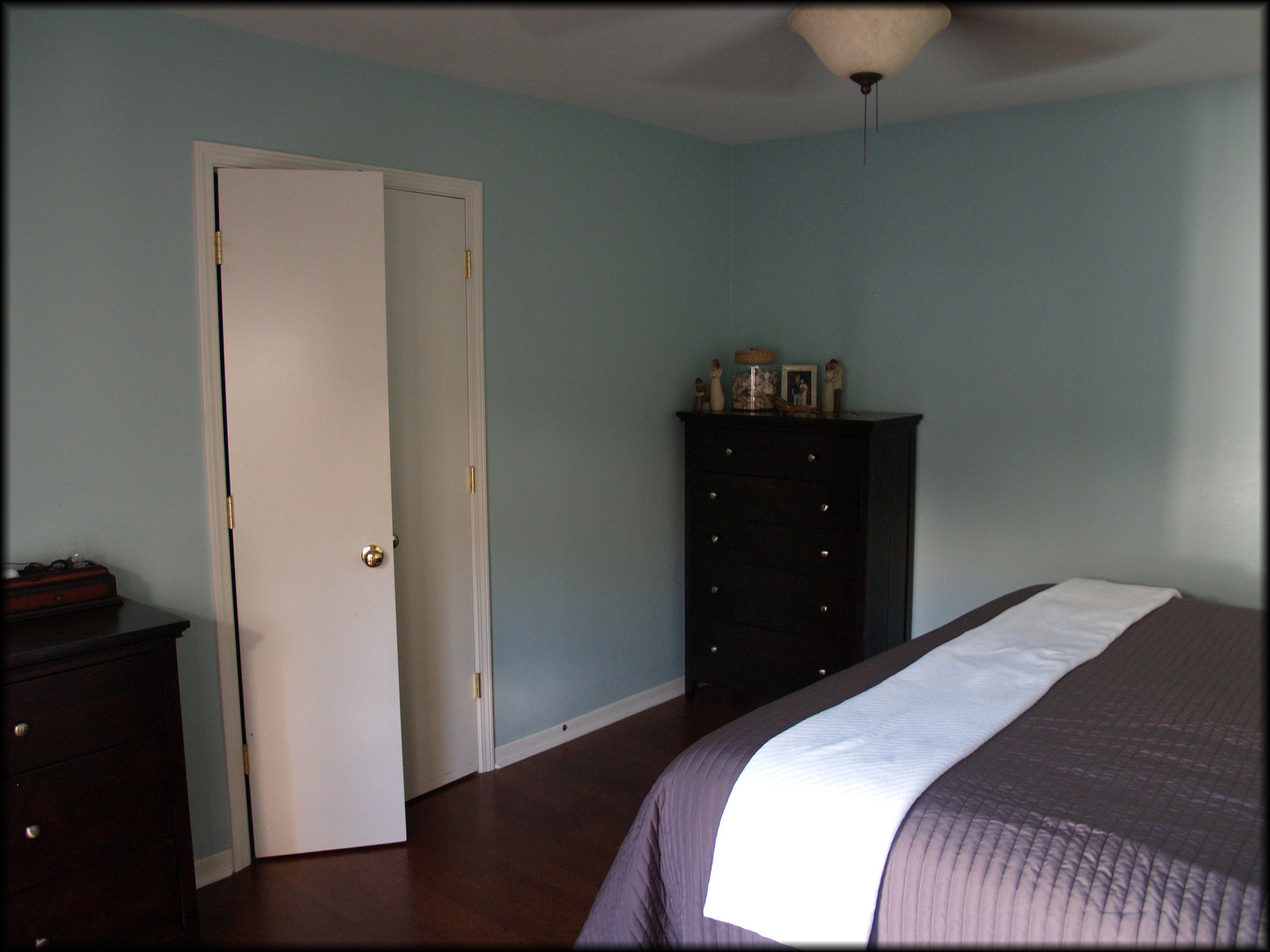
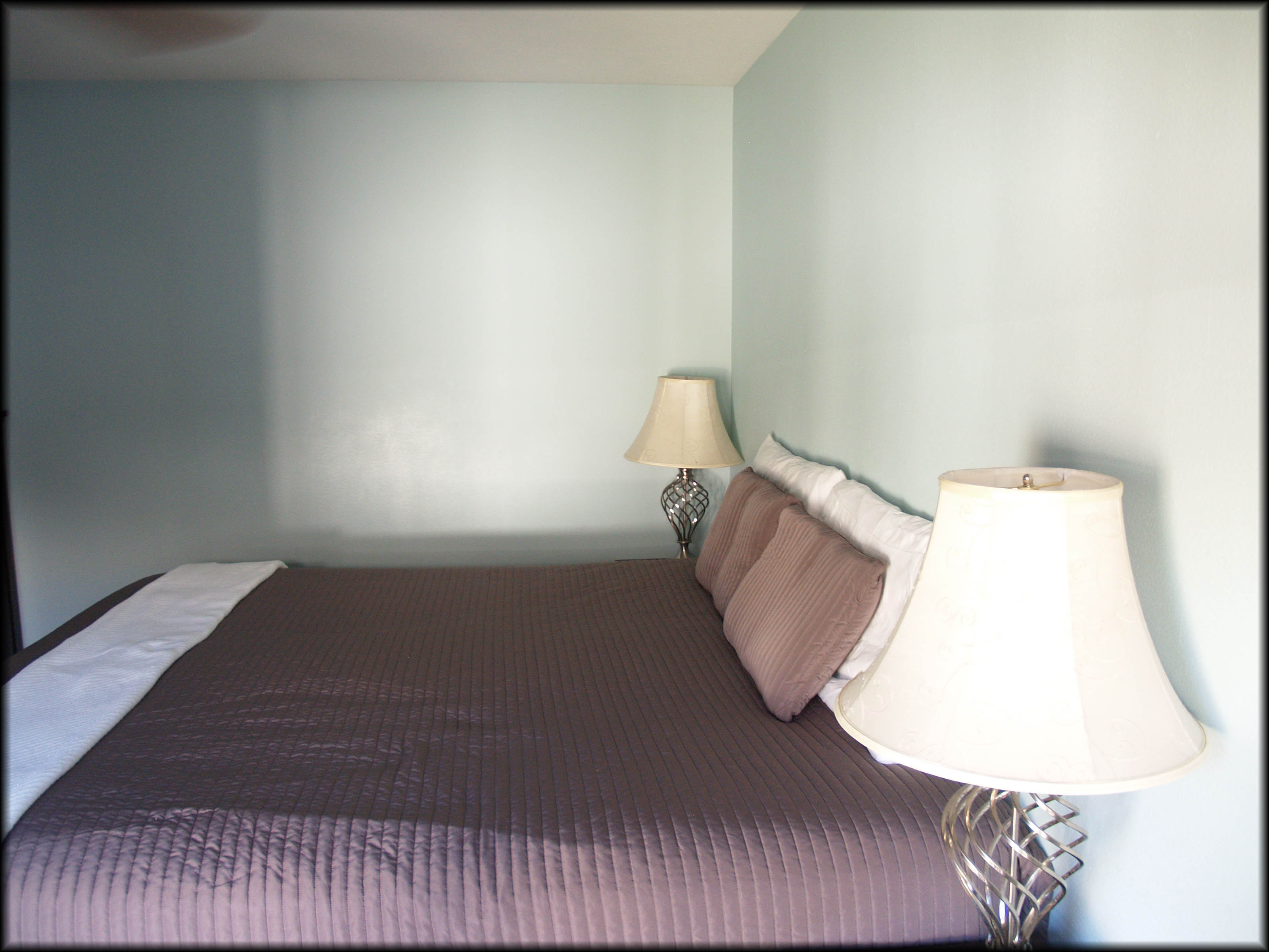 It’s very clean and organized, which are huge pluses, but with the lack of wall art and a headboard it makes the room feel stark. Not the first impression you want to give your potential buyers.
Master Bedroom After:
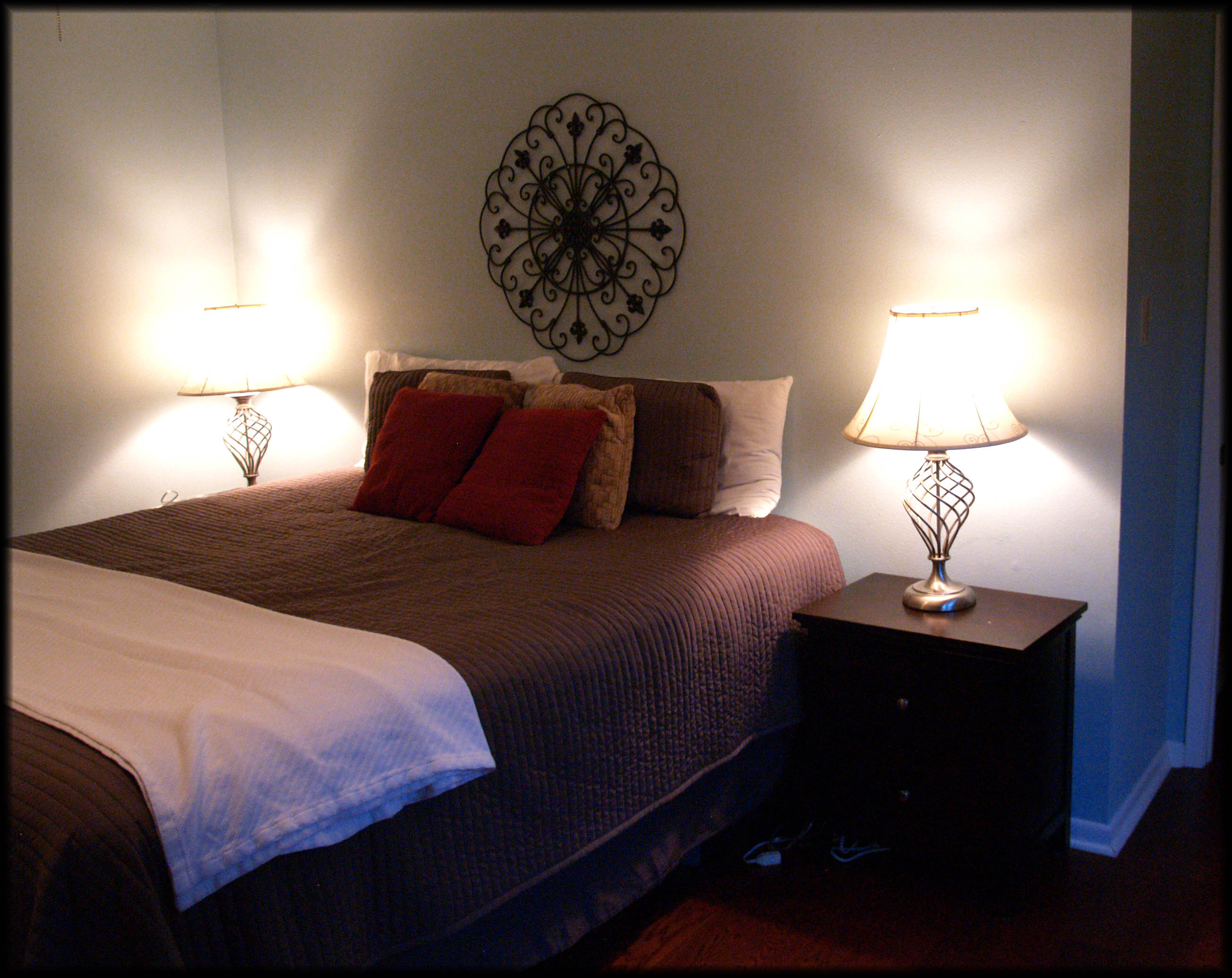
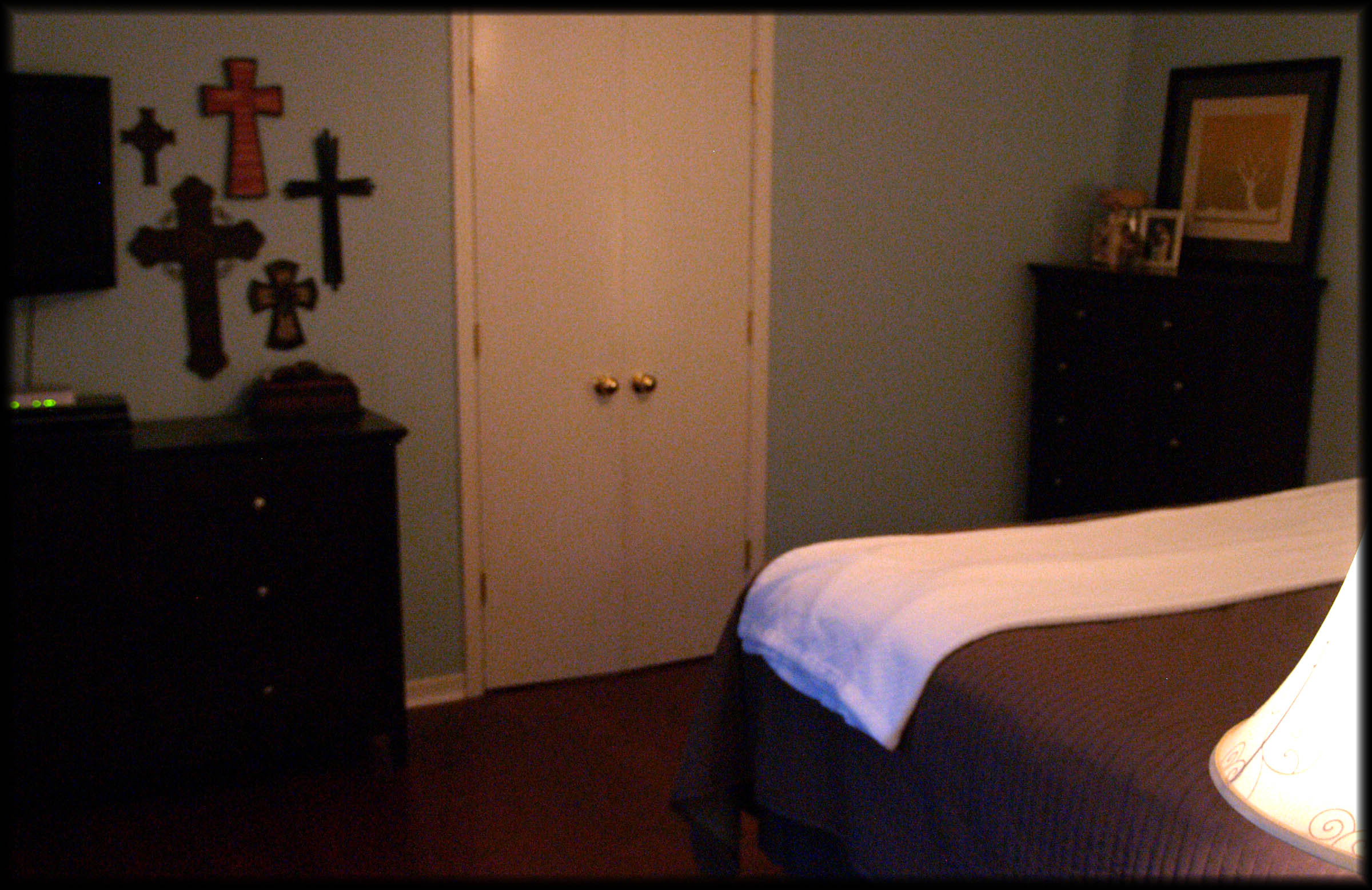 We used a large iron medallion to enhance the area where a headboard would be and also added some wall art to help balance the weight of the television. Throw pillows were added on the bed to add a more “cozy” feel, and we opened up the throw at the end to give it a more hotel/spa-esque (so not a word, I know) feel. I put a collection together on the chest of drawers of the homeowner’s items and used a piece of art for the backdrop.
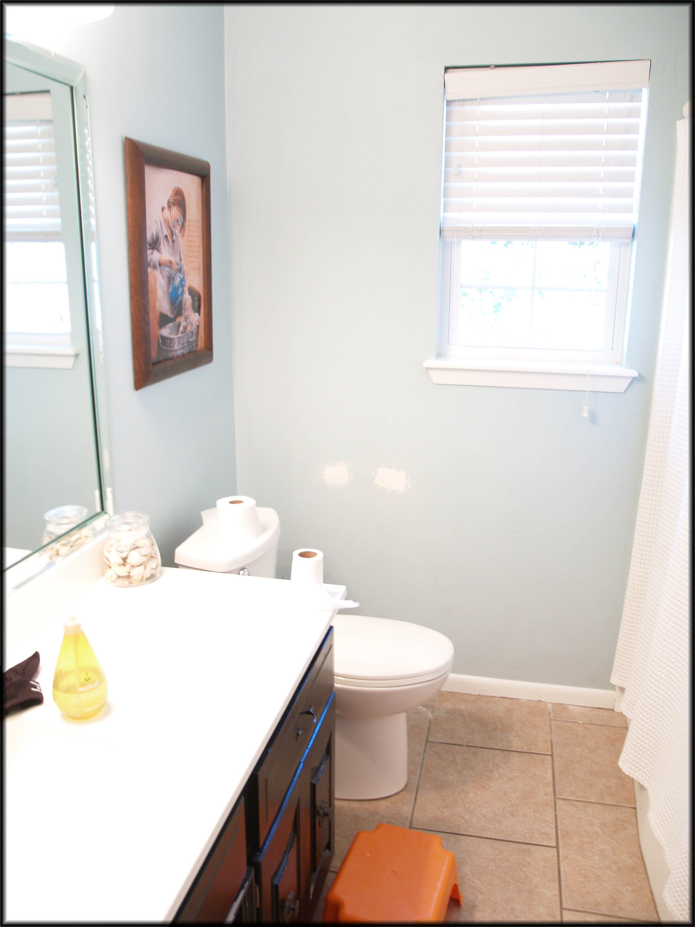
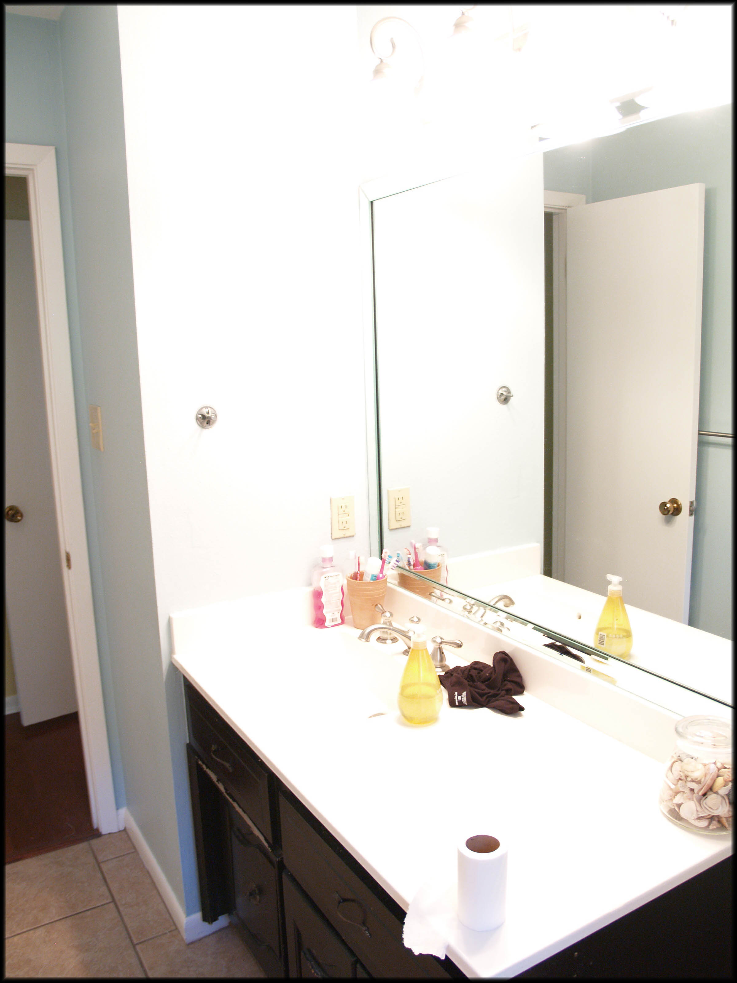
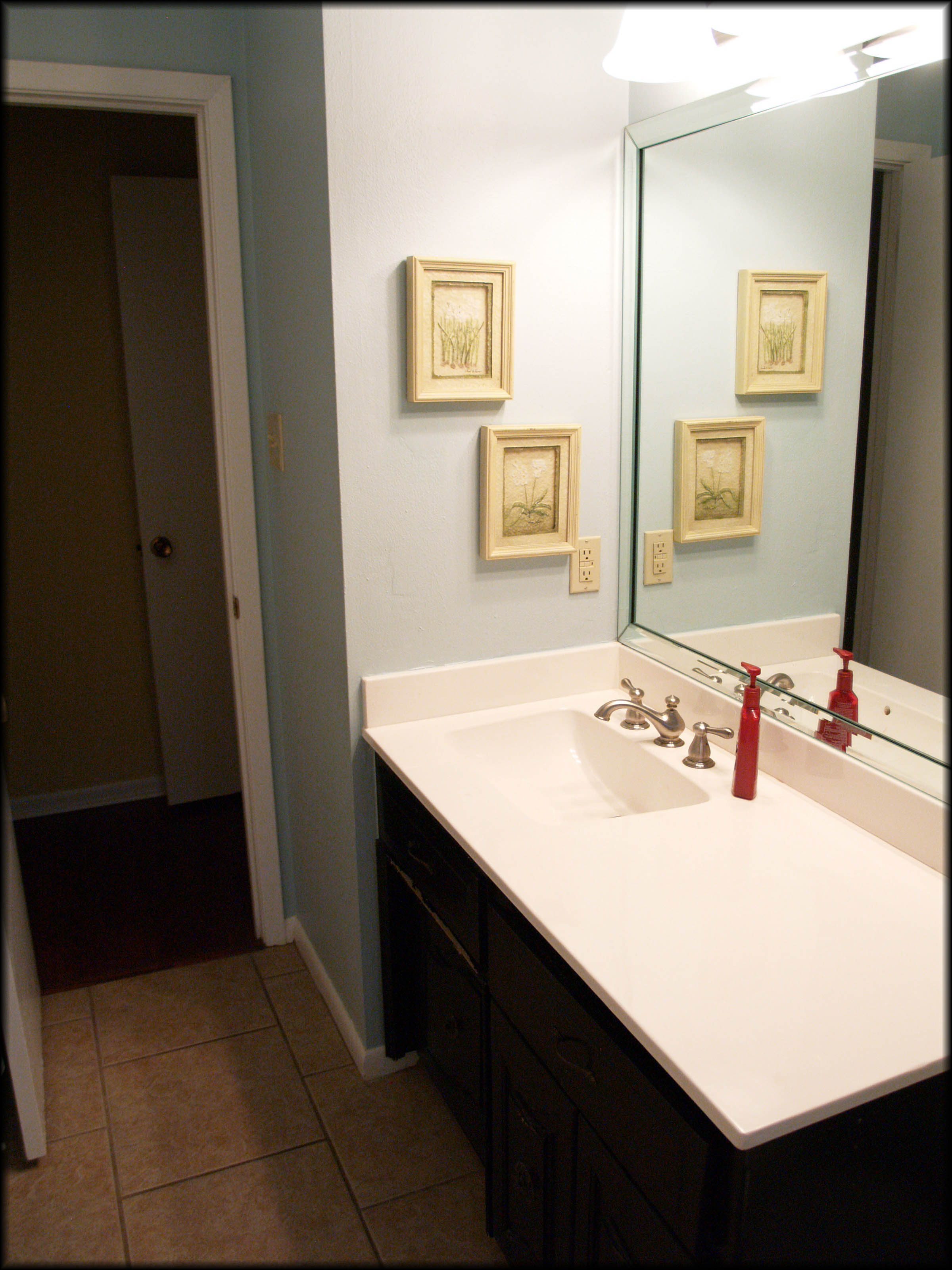
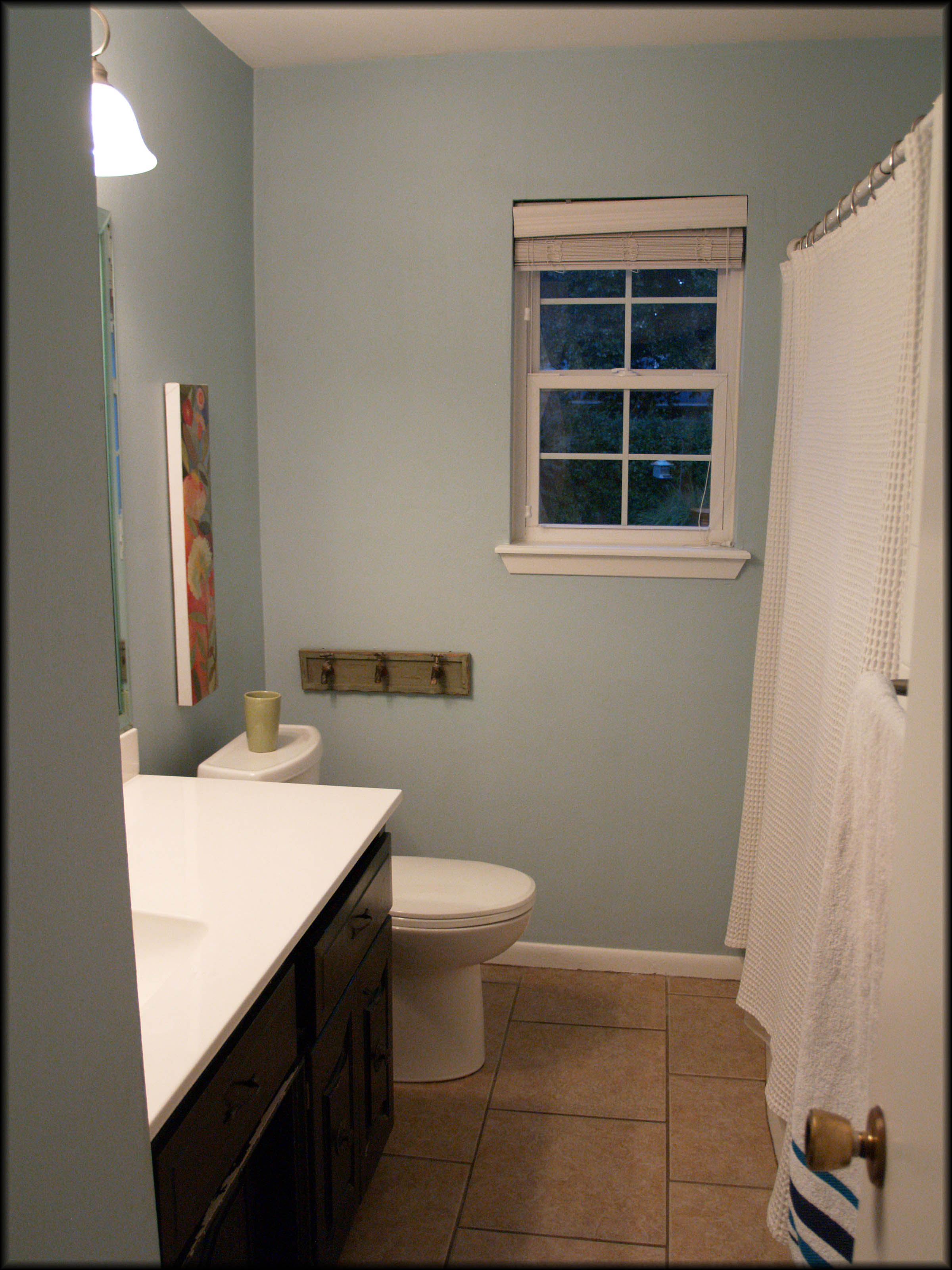
Master Bath Before:
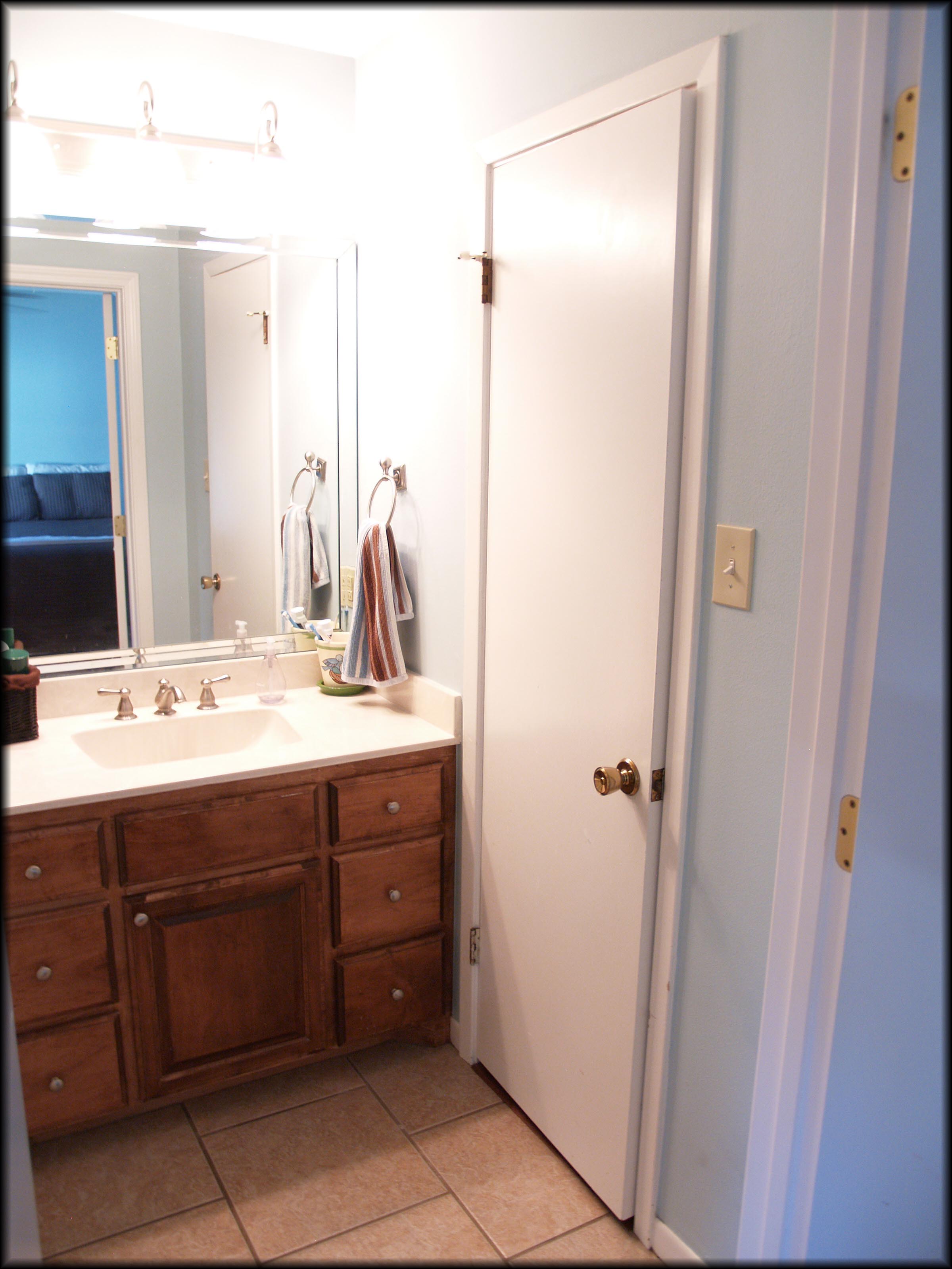
I bet this is exactly what most of our bathrooms look like, and guess what, that is totally a-ok…except for when you put your house on the market. Our goal for the bathroom was to tidy up a tiny bit and add a sense of home by putting something on the wall.
Master Bath After:
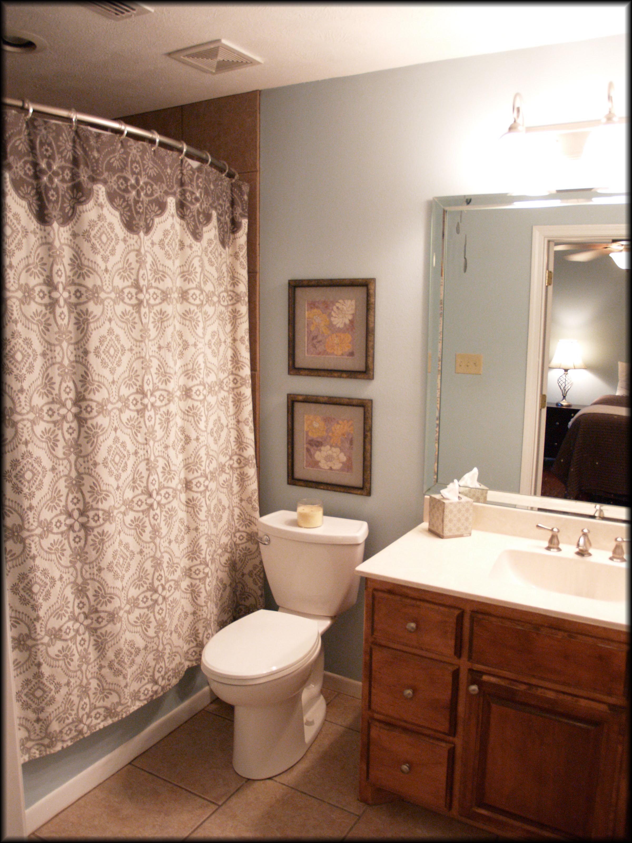 The bath was an easy fix! First, we removed any items that were not necessary. We added some beautiful prints to the wall which helps your eyes to move across the space throughout the room. Also, see what a difference moving the basket, toothbrush holder and towels make?! Such a small thing, but big impact. Bathrooms should have a clean, spa-like feel. Tip: Clean, white, fluffy towels are a great way to give that feel.
Family Room Before:
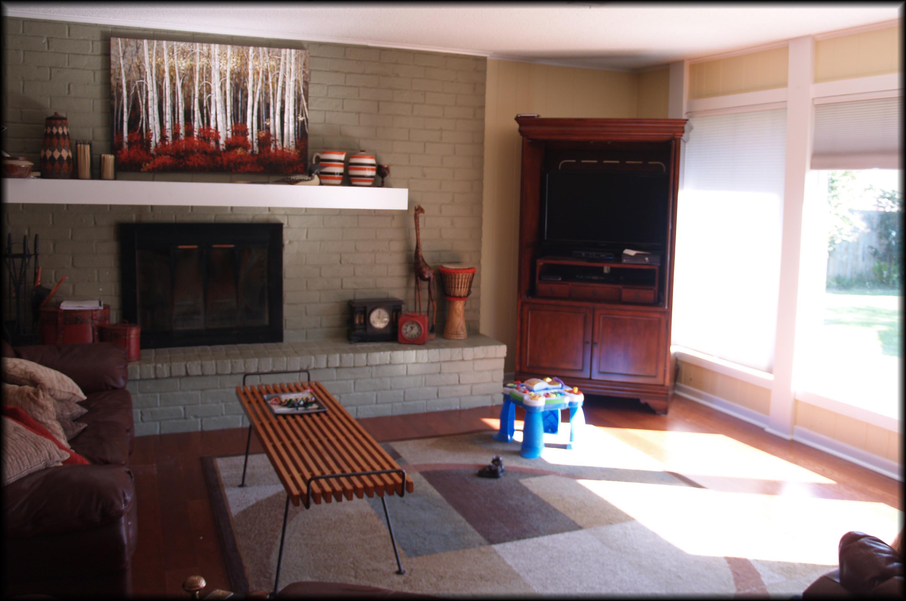
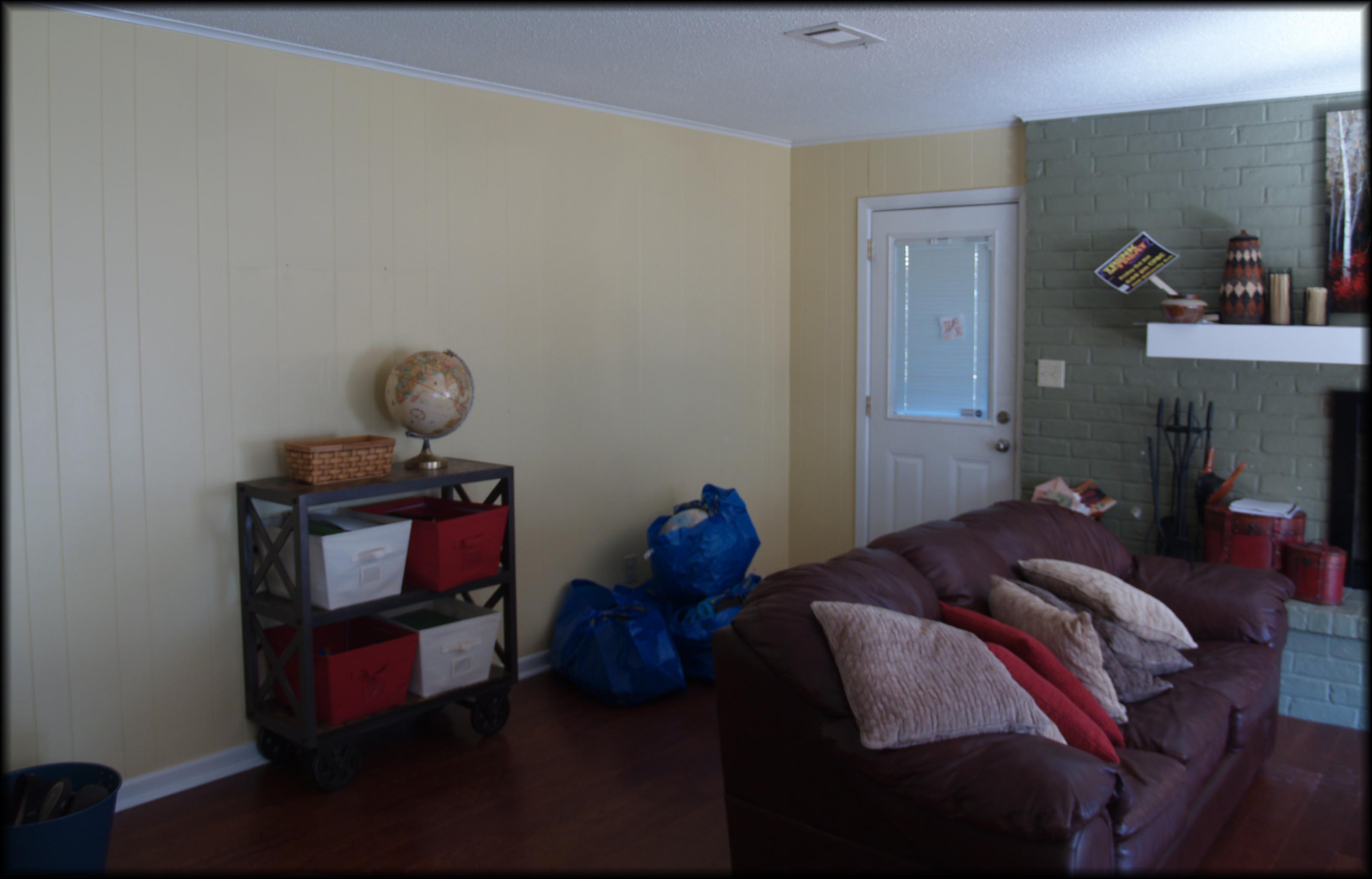
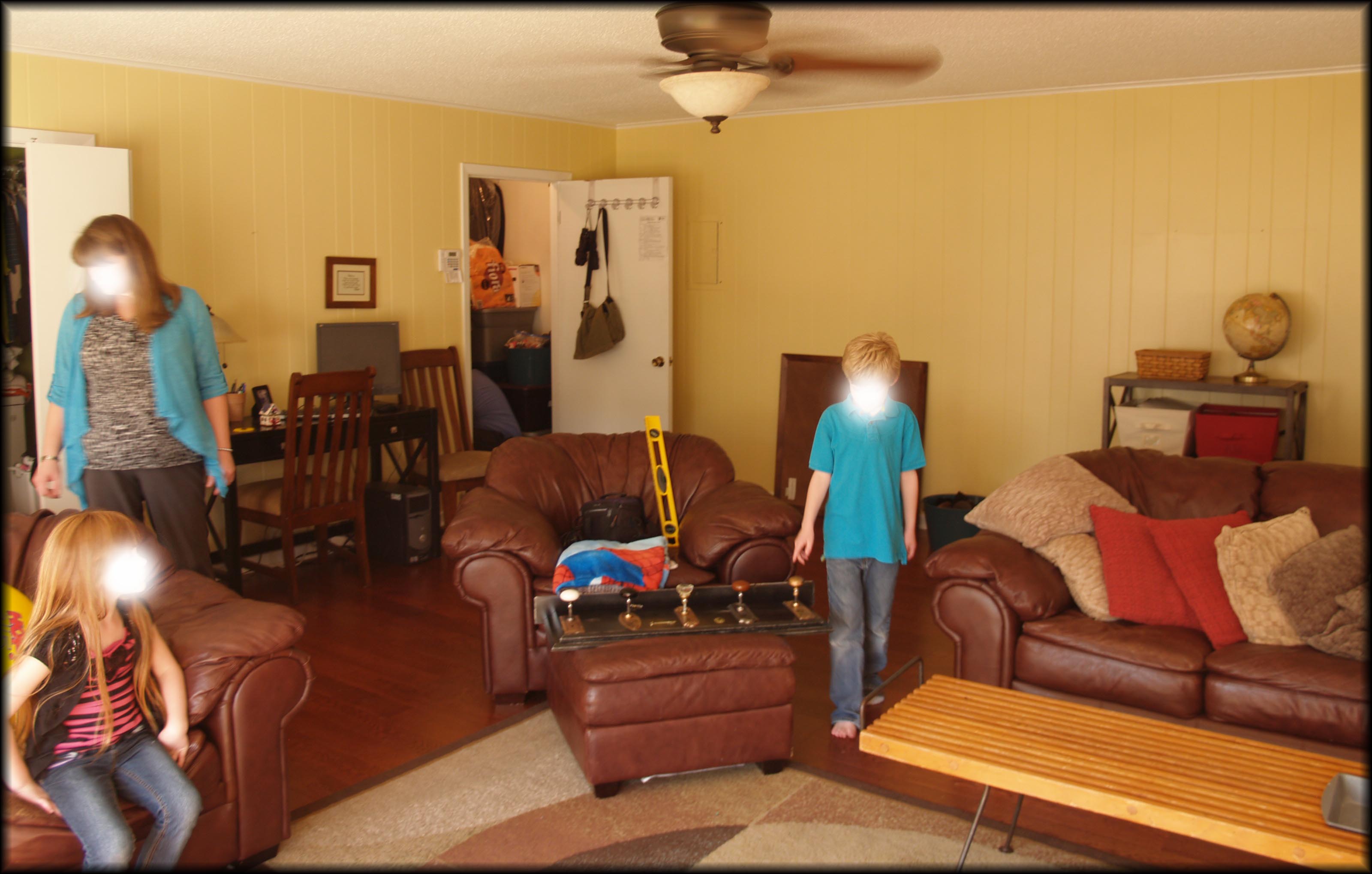
A family room is an asset in the market. A room where you can actually live, and that is exactly what our homeowners do in this room. And oh my word do you see those picture windows?! The light in this room is amazing!! The basics of this room are good, but with a few changes and it can be great.
Family Room After:
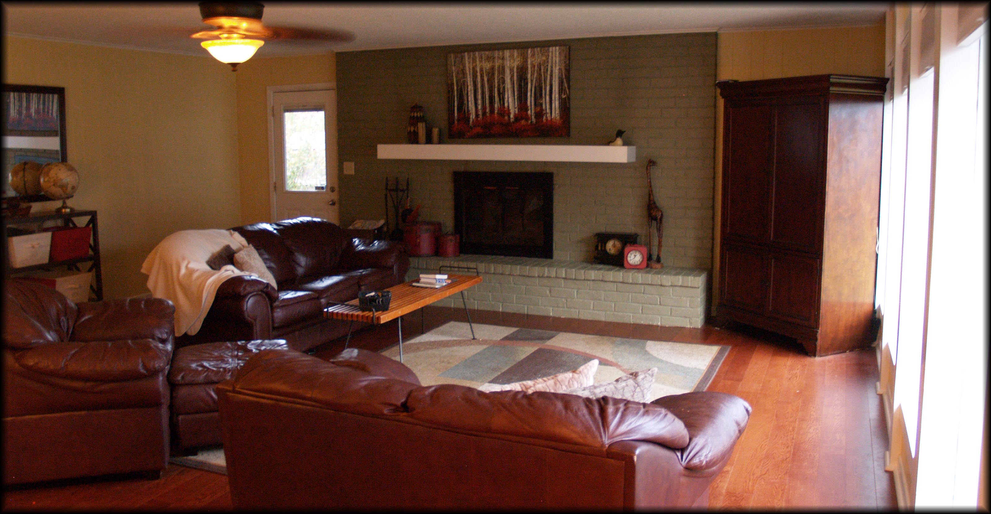
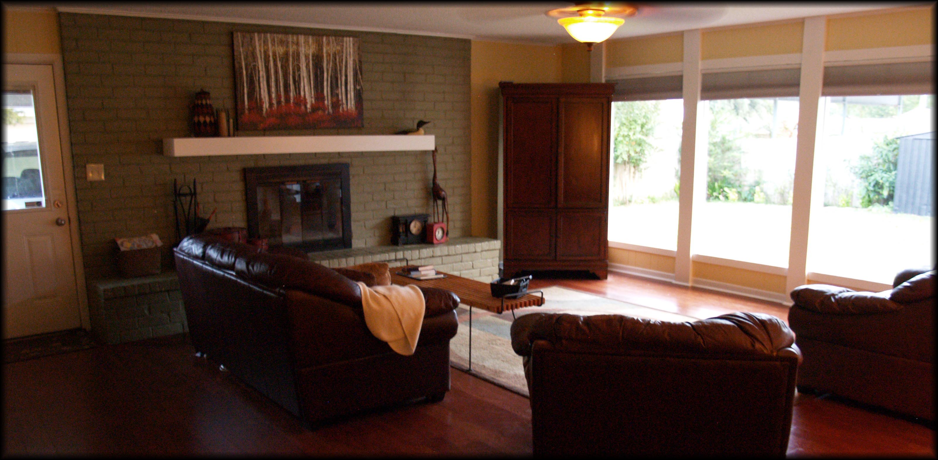
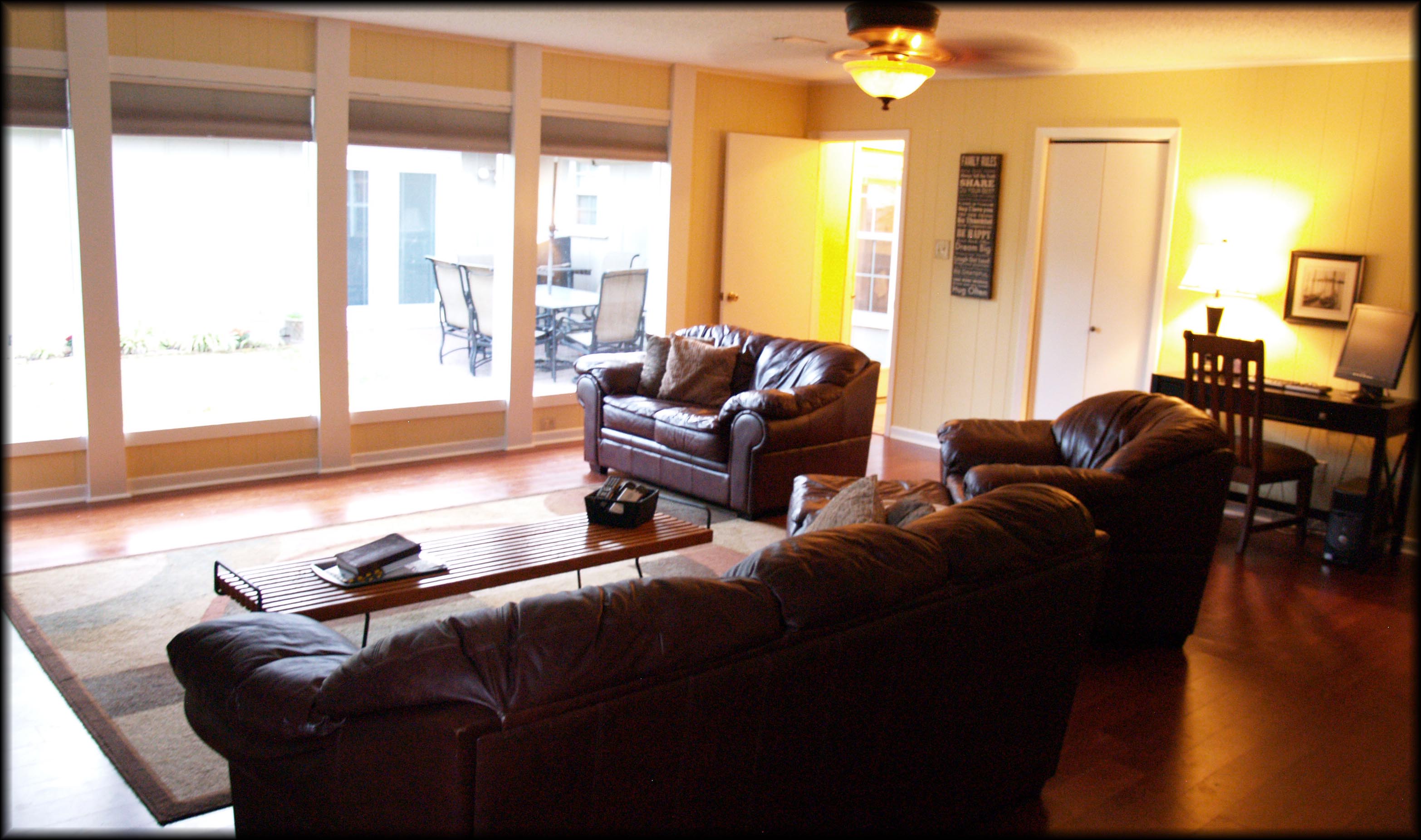 Only a few simple changes here. Of course, first de-cluttering of the space. This step always makes a big difference in any room. You can see a great example of this in the before and after of the fireplace area. Just by removing some of the items on the mantle and on the hearth it opens up the area and makes the mantle pop! We added a couple of pieces of art and removed some as well. Love the way the desk turned out, by changing out art and the lamp it gives it a more cohesive feel to the area. TIP: Place a throw on your couch to make it feel more inviting and warm.
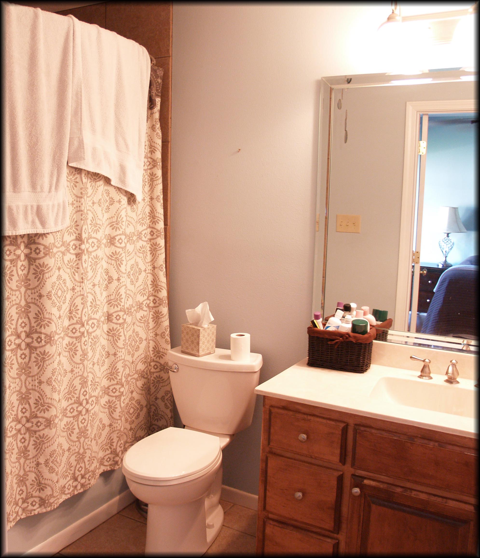
MAIN BATH BEFORE:
 Love the color of this bath and the bright white countertop! With a few finishing touches this bath will be ready for its close-up!
MAIN BATH AFTER:
To start things off, I know you know what I am going to say, right? Paint the walls fuchsia! Hahaha…yes, de-clutter. After de-cluttering, I switched out the homeowner’s art for some pieces that were less taste specific. The more generic the art, the better. We also added art pieces near the mirror; remember you always want your eye to move through the space. Lastly, our owners touch-up painted the repaired areas on the wall. Make sure you don’t leave your buyers with a to-do list. That to-do list cuts into your bottom dollar.
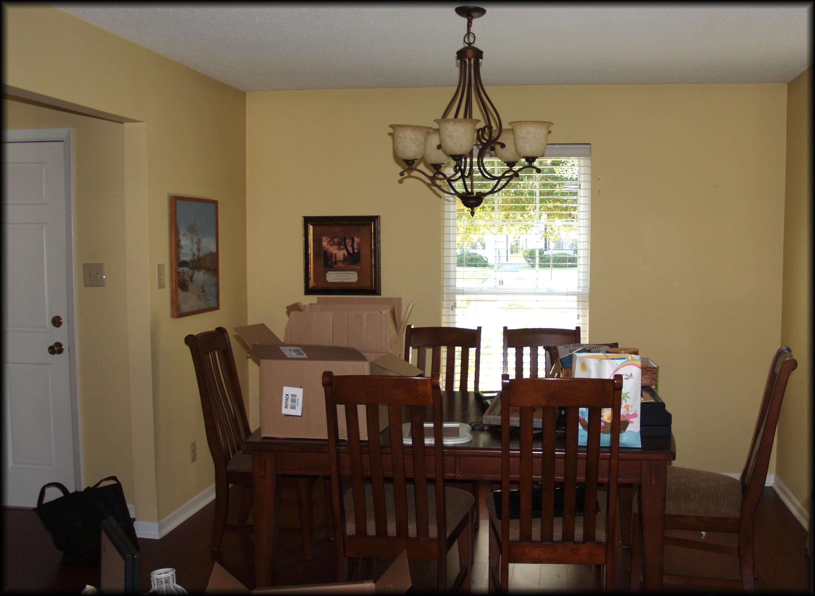
ENTRY/DINING AREA BEFORE:
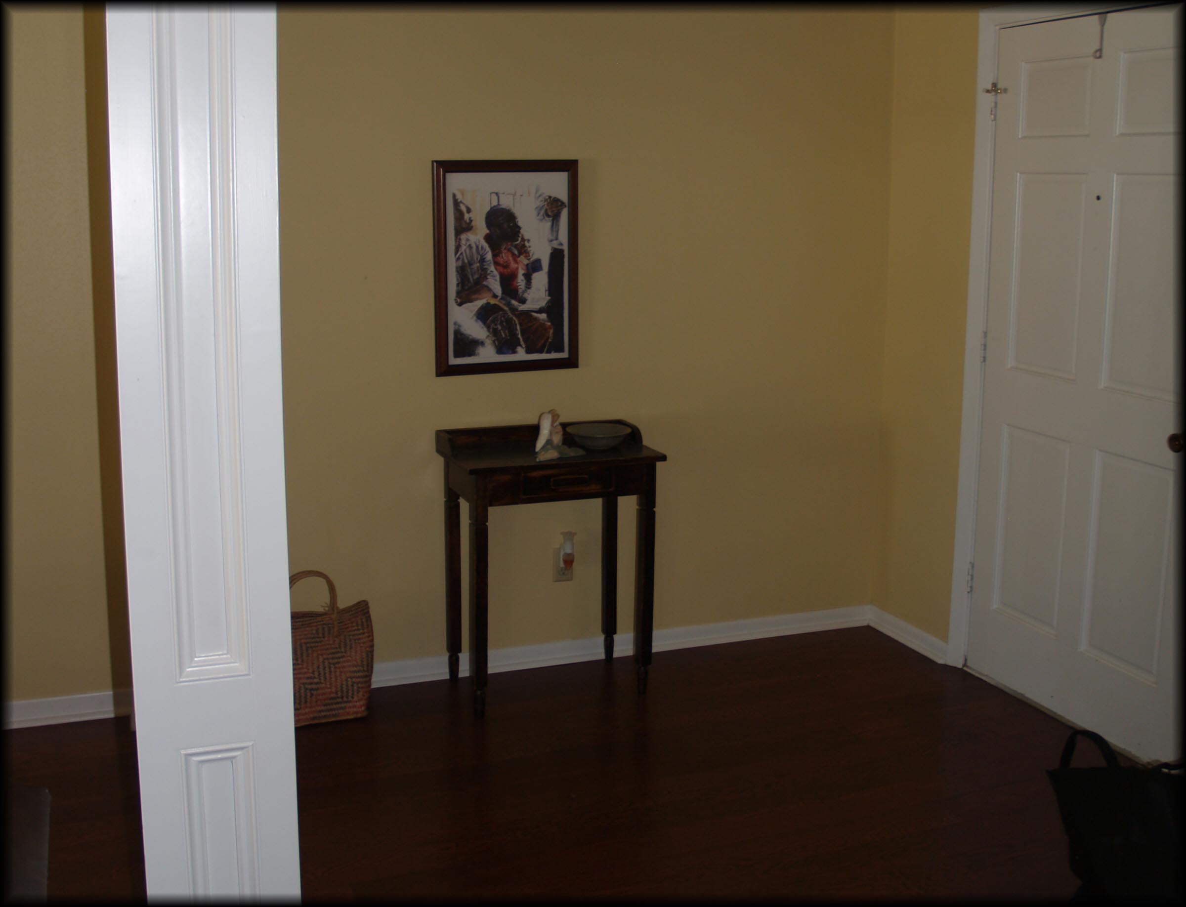
This is the first area you see when you walk into the home. The first impression is sometimes the only chance you get. If a buyer doesn’t like what he/she sees in those first 30 seconds they have already written off the house before they even give it a real chance. We don’t want that to happen here!
ENTRY/DINING AREA AFTER:

Our buyer won’t be writing the space off now! After removing the boxed up items you can feel the openness of the area. Before, the art lacked a connection to each other and the space, so we added a few of the homeowner’s pieces they had stored. All the table needed was a beautiful bowl with yummy fruit inside waiting to be eaten…of course try and refrain at least until after your buyer comes through.
The entry way’s table wasn’t beefy enough for the space. The area was missing that “grandeur” feeling. By playing switcheroo with another table in the home and adding a lamp and a few decorations it gives the welcoming sense it was lacking before.
FINAL THOUGHTS:
The homeowners didn’t spend any money on decor for this stage, we reDesigned with pieces they already had or had borrowed and did some rethinking of spaces. I understand that in the real world your home will not always be camera ready, but a quick clean up/de-cluttering before showings and especially your listing pictures can go a long way. Realtor.org states that over 90% of home buyers look at homes online before purchasing. So what does that mean for you…get your home ready for her close up!
Need help…give reDesign INC a call!